Tuesday 4 February 2014

Target - Test Piece


This work had the theme of a popular book and a movie, "The Hunger Games". The materials that i used were stencils, ink, pencil, marker pen, watercolour, acrylic.
 

1. I drew the target on an A3 piece of paper, using a pencil.


I decided on the colours and next, i have painter the piece: first the target then the background, to make sure the colours would work well with the colours i wanted to use on the target.

I drew over the bird, letters and the edges. 

My work was based off the style of two artists that i have reasearched: 
Peter Blake
Primary colours, high contrast, secondary-colour in the background
Robert Indiana
Militairy, stencil writing, motive and an image in the centre.


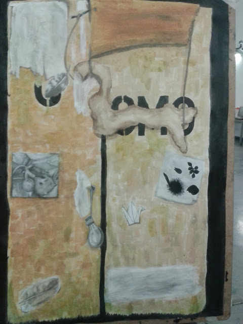
Final piece for Container of Curiosities - fine art


Materials: ink, pencil, watercolour, tea stain, coffee stain, acrylic, marker pen.
Genre: Trompe L'Oeil

Photo of the original:

Fine art - Tryptich


I created a piece of work made out of 3 different elements, meaning it it a "triptych." The materials i used were: acrylic paint, marker pen, ink on newspaper on wood. The theme of the pop-art was The Hunger Games.

1.

I have decided to do two targets and one line drawing instead of target+collage+line drawing (and use collage in the background)
 This links to the work of Jasper Johns: "Target with four faces" where Johns used collage newsprint on wood, to paint the target over it.

First, i decided on the possible layouts of the final outcome:
I decided the first one will be the best to make, because of the way the targets will be the simillar factors, however the bird will stand out more more on the side. 


2.
I made 3 backgrounds out of collage, using black and white newspaper articles, making sure no colour was included so that the images i was about to make on them would stand out more. 

3.
i drew the outlines of my 2 targets with a pencil. Next I painted them in twodifferent styles of two artists, modified by me slightly:
Inspired by Jim Dine

In the style of Peter Blake

4.
The final image, line-art, was made out of thick, solid lines in the style of Julian Opie (made with a marker pen)
Julian Opie's line-art.


This is the final outcome:


Monday 16 December 2013

The Saatchi Gallery trip

Our class went on a trip to the Saatchi gallery, in purpose to research the artists/get inspired by the work presented there. In the gallery, we've seen the work of many different artists such as:

Zak Smith: 

"Girls in the naked business: Sasha Grey" (acrylic and metallic ink on paper)
"Things i drew and pinned to the wall" (Acrylic on paper)

This artist's style in usually collage-like, a collection of many images and subjects painted onto paper. His work usually portray controversial, sex-related things and people and are created in a pop-art style, visually similar to Richard Hamilton.

---

Marcelo Jacome:


"Planos-pipas n17" (Tissue paper, bamboo, fiberglass and cotton thread)
"Planos pipas" in the artist's native language, Portuguese, mean "kite-planes" and the art work is made of of the same traditional materials the kite planes are made. The bright, contrasting colours could represent the nature of childhood (of the artist) as well as the creative, unusual and imaginative shapes it is made out of.   

---

Sean Dack
"Jigsaw" (Digital C-print)
CCTV #2 (Digital C-print)

Dack creates highly digital, modern-looking prints using mostly photoshop - pixelasation, montage, filters, blurs etc. The purpose of his work is not to present the image as a faithful, exact copy of the object being photographed like in the traditional photography, but to show it in a complete different way. Sean Dack’s work operates within that murky territory of photographic unfaithfulness, taking as its source images that really ought to co-operate, like CCTV footage. 

---

Gerald Davis
"Fagboy 1986" (coloured pencil on paper)

Gerald Davis' work called "Fagboy 1986" has an autobiographical basis: as a child, Davis dreamed of becoming an animator, inspired by Disney. However, drawing being his hobby seemed weird to his brother and his friends, and the name "fag" (meaning gay/outsider) stuck to him back then. The work represents the nature of bullying, misconceptions and gender-based stereotyping that still happens in our days. 

---

Jessica Jackson Hutchins

"Couch for a long time" (Couch, newspaper, ceramic)

The title of Couch for a Long Time, is a mixed media sculpture is made out of various made and found objects - ceramics, newspaper, re-cycled old couch. The meaning of the piece is based around time: how it passes and is being wasted by humans. Ceramic pots and sculptures seem to sit on the couch like people and waste their time on recieving various information from the media. The newspaper pieces are mostly articles about politics and the current US president - Obama, implying how much information we recieve about the politics and that our lives are very much influenced by the government. 

---

Han Feng
"Floating City" (Tracing paper (laser print) and fish tackle thread)

Feng's piece, "Floating City" is what i consider as very original to the rest of the things we've seen in the exhibition: composed of hundreds of tracing paper buildings of various sizes, their laser- printed details deriving from images of city architecture, which are grouped in dense clusters and hung from the ceiling with transparent fish tackle thread. Its neither a sculpture, drawing or a painting and it combines the digital media (laser printing) with hand-made art. 

The piece is hovering a few inches off the gallery floor, looking almost dream-like. Depicting a city – something we associate, especially in recent times, with population density, atmospheric pollution, architectural diversity and multicultural vibrancy – as something weightless, depopulated, semi-transparent and fragile, Feng’s work asks us to consider the city as something imagined, an idea as much as a place. This might be what a utopia looks like – a notion expressed in language, impossible to realise in reality. 

Thursday 28 November 2013

Photoshop and digital art - artist research

John Goto 
Out of NowhereApolloGoto_06W
A british artist, using digital media to create his art. Goto's work i usually based arround culture and society, modern or ancient. The content of his art often features people, monuments or landscapes. He often does many pieces based around a certain theme/project.

Jeff Wall
Jeff wall uses image manupulation in his work, mixing backgrounds and people. Like shown in the first picture, he doesnt always try to make his work look realistic, define shadows etc, making original and un-realistic art.

The Jackson Twins
The Jackson Twins base their work mostly around themselves, showing their beings in different ways and surroundings. Their work is realistic and they make their art seem auhentic, which makes them slightly different than for e.g. Jeff Wall. 

Tuesday 26 November 2013

Box in style of Joseph Cornell - 3D - Maquette

I made a "mock" version of my final container idea, before i made the final container, to make sure it will be suitable. 
The box has 3 sections, one large and two smaller, to fit the onbects of various sizes that i made. 
The final box will be approx. 40cm x 30 cm x 20 cm, making enough space to make the objects arranged in a 3-Dimentional way.


In the centre of the bottom part, i have decided to place a "hanger" for objects made out of wire, simillar to the "conker" object that i made out of wires and hard-foam. 

Monday 11 November 2013

Photoshop - Final Piece

First i have taken a photograph of the background which i decided was suitable:
The large amount of space and an empty wall building make it a good background
  1. I've taken a picture of myself on a dark backround, to then cut around it using the selection mask.
  2. Next, i reated a new, transparent layer on the picture of my back-ground image. Then i pasted the picture of me, now without any backround.
  3. With the eraser tool, i removed any remaining background from the old image around me, on the new layer.
  4. I re-sized "myself", to make the image more suitable for the background and make it look more authentic.
  5. With the same method i moved the picture of me, i've moved the image of a train ticket that i have scanned in earlier onto the work.
  6. I re-sized, sotated and re-adjusted the "ticket" to make it my size and with the eraser/brush tool i made it look like i was holding it. 
  7. Using the "burn" tool i added on some shadowing onto the images, more at the bottom considering the light was coming from the top/left corner of the image.  Also, with the dodge tool i increased the amount of light on the top of the figures in the same manner.
  8. I lowered the opacity of the brush tool, and with the colour being set to black i created the shadows on the ground.
  9. I saved the image as a .jpeg to keep the quality at maximum.


The work has been produced in a combination of two artist's styles: The Jackson Twins (using myself as a model) and Jeff Wall (mixing objects/people with backgrounds in which they weren't in the first place.)
I think this work was a success, due to the shadowing and shape/size, making it look authentical but still surreal due to the size of the object.

Monday 21 October 2013

Test piece - Filters, smudging and layers


A piece i have created in class today. 
I have made it as a test-piece before i made my final image. 
The building as a background was a good base to start from, because there was plenty of space on it's wall to move and edit and image on. (one of my objects)
Experimenting with different layer-types and smudge tools, i made the final outcome above.

Photoshop - Mr. Potato Head


Mr. Potato head
I used one of the "sample" faces, to then combine it with various "facial elements", image files provided by our teacher. Using the copy/paste method and the "move" tool, I arranged them on the "face".
Using the "rotate"tool i made them fit better, creating a pop-art styled image.

Monday 30 September 2013

Artist Research - Fine Art

Jasper Johns
File:Jasper Johns's 'Map', 1961.jpg 

An American contemporary artist who works primarily in painting and printmaking.
The subject of his work is usually maps, flags, numbers and targets, created with acrylic paint and other materials such as plaster.
His work was usually surreal and the colours are contrasting or complimentary. 
Many of his paintings are styled in pop-art style. 

Lisa Milroy

An Anglo-Canadian, contemporary still-life painter, mostly painting items such as shoes/clothes and vases in the form of collections. Her work is often painted on plain backgrounds, the painted items are in formations such as grids and lines.
Her work is usually oil on canvas. The colours compliment and the painted items stand out, due to the usual lack of/pale background.

Jim Dine

Jim Dine is an american pop-artist/traditional artist and sculptor.
In his art he uses mixed media, including ink, pencil, paint, etc.
He is famous for many of his artwork presenting tools, which are usually in colours with low saturation, almost gray-scale.
His pop-art however, was usually constructed out of contrasting, intense colours. It was usually showing every-day items, presented in a pop-art style.


Eric Conklin

An artist working in the Trompe L'Oeil style.
As the materials he uses oil and paint on oak board. He uses realistic colours, often warm, brown to orange and paints the background of the pieces black, making the bright colours more stood-out.
The images often feature paintings, making the "painting within a painting" effect simillar to the work of Cornelius Gijsbrechts.

Paul Wright

A british decorative artist, specialised in the Trompe L'Oeil style. His materials of choice are watercolour or acrilyc paints on canvas. The subjects of his work are usually landscapes.
I think tthat his choice of materials makes him different from other artists, who mostly use ink or oil. His work is somehow "messy", but with a high amount of details, which makes it simillar to Jim Dine.